Harmonizing Functionality and Aesthetics: The Interior Design Mastery of Koray Yavuzer Architects Office
Interior design plays a pivotal role in shaping the atmosphere and functionality of a space. Architects and designers have the ability to create extraordinary environments that inspire and reflect their unique vision. Among the influential figures in the field, Koray Yavuzer Architects Office stands out with our distinct design style. This essay delves into the captivating interior design style of Koray Yavuzer Architects Office, exploring its key characteristics and the impact it has on creating remarkable spaces.
Our priority in our office, which has a scale of volume that is compatible with our mission to stay as a boutique design office as a family aspect, was to reflect the ratio of occupied and vacant spaces in the physical environment. We have found solutions to functional and design aspects in a small square meterage that meets the requirements of being an architectural office. As soon as you enter the office, you will be greeted with a welcoming atmosphere of an architectural office. Let’s take a look together at the details that provide this experience.

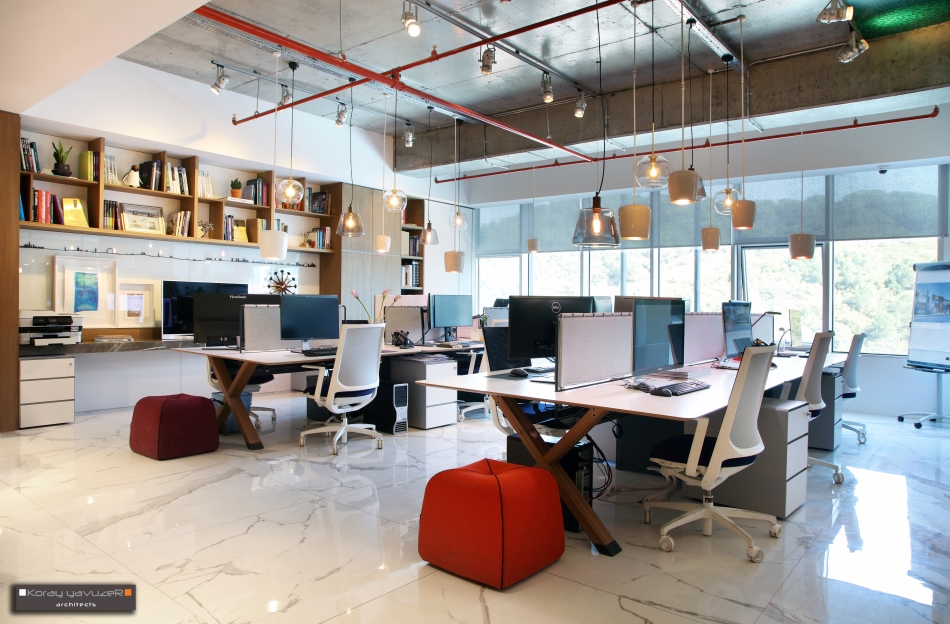
We have created an open workspace that can accommodate twelve individuals and allow them to create their own personal areas. Ensuring that each designer has a sufficient and ergonomic space has always been
important to us, along with ensuring technological adequacy. When you open the office door, you directly connect to the main workspace, accompanied by an enjoyable corridor. We have positioned support units around the main workspace. The section where the assistant and accounting departments work will be separated from the main workspace by a creative, translucent glass partition. The executive office is positioned in a way that overlooks the main workspace, with semi-permeable areas that preserve personal privacy. Our aim was to maintain continuous interactive communication between units, which formed the basis of our approach. With our layout plan and the materials we used, we achieved a design that fulfills our purpose.

The meeting room, where meetings with clients and partners will take place, is located farthest away to avoid disturbing the team. Due to its location, the executive office has a commanding position over the meeting and main workspace. We created shared facades for the executive office, with glass partitions forming its boundaries, which not only provide dominance but also ensure the preservation of personal privacy by incorporating elements such as artwork, a fireplace, and a bookshelf. Thus, we created semi-open and semi-closed facades with design elements that differentiate us from standard office designs.

In our luxurious and chic design, we have brought the element of fire into the office environment with a fireplace. We have created an open library where we aim to showcase our books and magazines. Instead of creating separate spaces for materials, we designed wooden-clad visual storage cabinets as design elements on the peripheral walls of the main workspace, easily accessible to the team. Our goal was to balance occupied and vacant spaces by incorporating open storage areas such as libraries as design elements.
We have also reflected our general design approach and principles in our office. We have created an office that combines our design elements with our needs, without compromising our glamorous contemporary design philosophy. Our office now demonstrates a demo of our design philosophy to our clients, partners, and even our team members.

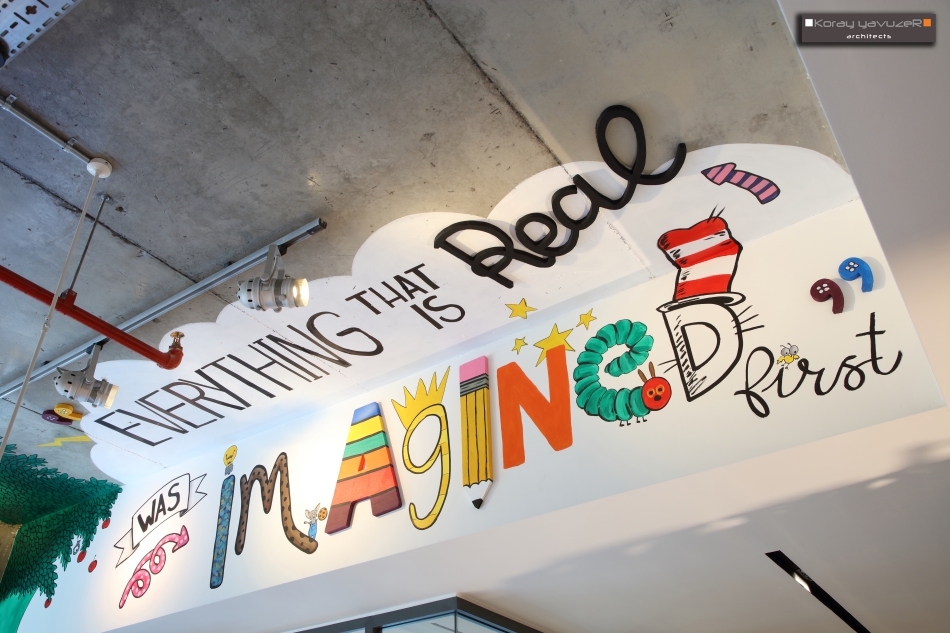
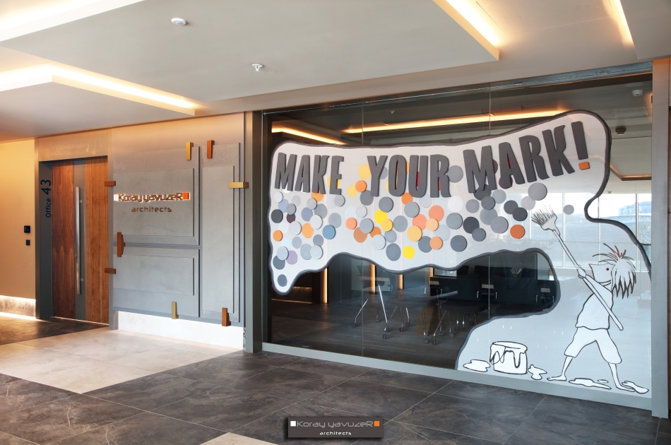
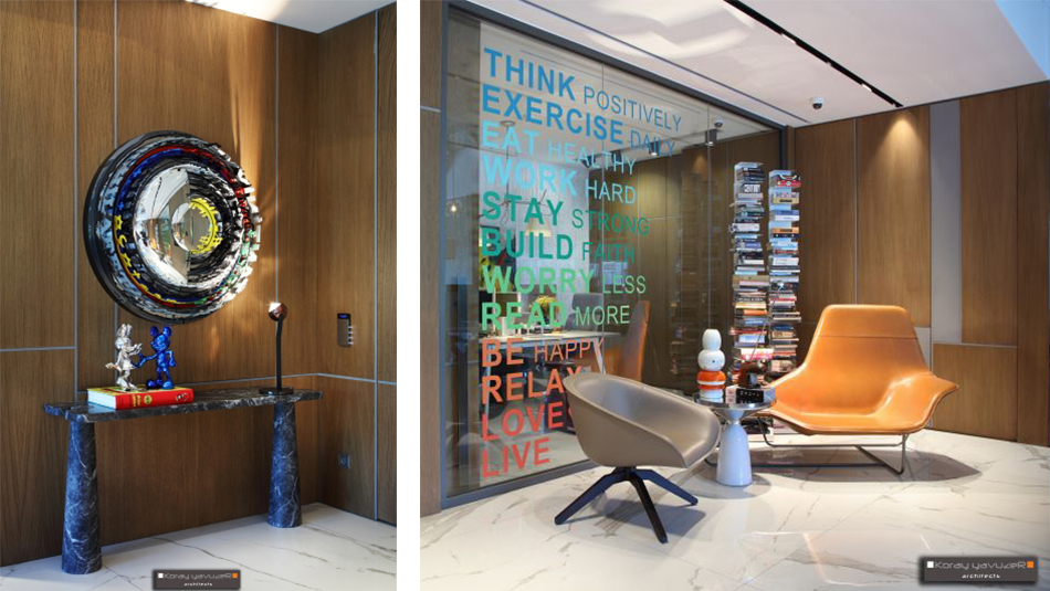
In our compact, functional, ergonomic, yet luxurious and elegant office, we have added surprising corners that showcase our fun side. Architecture is a profession where analytical thinking and art come together. In this context, we wanted to bring our playful, colorful, and mischievous aspects into our office, alongside our functional solutions that demonstrate our analytical side. We positioned artistic touches as surprises in various corners of the office. When we turn our heads to different corners of the office, we see colorful mural arts, paintings, and sculptures from various artists. Humorous objects that we believe have an architectural line, neon wall writings that represent our motto, and sticker writings on glass partitions reflect the fun side of our office.

Minimalism with a Warm Touch! One of the defining characteristics of Koray Yavuzer Architects Office’s interior design style is our adept use of minimalism. Clean lines, simplicity, and functionality are at the core of our designs. However, what sets us apart is our ability to infuse warmth and coziness into these minimalist spaces. We achieve this through the skillful use of warm color palettes, natural materials, and strategic lighting with artistic corners. This combination creates an inviting and comfortable ambiance that encourages a sense of relaxation and tranquility for our workspace.
We love our office because it embodies our needs, reflects our design perspective, supports us ergonomically, and possesses elements that showcase the artistic aspects of design.

